Decorative Word Ornaments are God-Awful
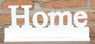
In what experts (me) are calling “the most stupid fucking trend of the decade”, people are continuing to buy and display “decorative words” in their homes, and I'm sick of ignoring it. I first noticed this phenomenon several years ago, and rather than speak up, I opted to stay silent out of politeness and hope it fucked off of its own accord, but here we are in 2018 and it's time to take a stand. For those of you with the extreme fortune to not know what I'm talking about, here is a visual aid:
These wretched things are absolutely everywhere, all near-identical, infesting even the homes of people I once respected. You wander into people's living rooms, and find yourself confronted by the word HOME, staring back at you from the mantelpiece. You turn away towards the window, only to find LOVE sat there on the sill. You excuse yourself to go to the bathroom and reconsider your life choices, but BATH or SOAK will inevitably be waiting for you. Watch out for the kitchen, for it, too, may contain an EAT, MEAL, or SNACK. I have yet to see an OVEN, but I am certain that someone, somewhere deemed it a necessary addition to their HOME décor.
Note how all of those words are single-syllable, simple words like you'd teach to a child; there's never a VESTIBULE ornament stood in their hallway is there? The target market for these items is the lowest-common denominator, they're accessible to anyone with a reading level above “functionally illiterate”, the dream demographic for whatever committee dreamt up this tat.
I find these things extremely obnoxious, mostly by nature of how non-obnoxious they strive to be. They are utterly devoid of mood, subject, opinion or content; their entire function is to fill space while provoking zero reaction from anybody and I despise them for it. Every element is cynically designed to be, and stand for, nothing. The colours are always whites, greys, and pastels, the most inoffensive pallet imaginable, and the font always as bland as they can find, because even Comic Sans would indicate some sliver of personality in their design or their purchaser. Even the words themselves, like HOME, are so fucking infuriating for how vapid they are; I know it's your home by the nature of me being inside it you fuck.
If there is any redeeming feature of these so-called “decorations”, it's that they usually have enough heft behind them to bludgeon the owner to death with, which is more than what could be said for the previous “worst decoration” trend of the 21st century: those stupid fucking “Keep Calm and Carry On” signs. I thought we had reached a low point then, but apparently I was dead wrong.
«Back to "Rants"»
